Pantone Colour of the Year 2016

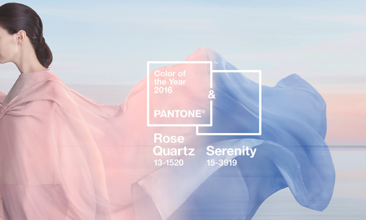
For the first time, PANTONE® have selected a blend of two colours as their go-to-hue for 2016: Rose Quartz (13-1520) and Serenity (15-3919). There’s no doubt they make a nice couple and the thinking behind this unison appears to stem from the recent trend for folk seeking a little ‘psychological reassurance’ from the day-to-day stresses of modern life through the practice of ‘mindfulness’. A balance is struck between the warm Rose Quartz and cool Serenity and the pluralistic approach to this year’s colour, according to PANTONE, is also tied into the hot topic of gender equality and the blurring of traditional perceptions of colour association: In many parts of the world we are experiencing a gender blur as it relates to fashion, which has in turn impacted colour trends throughout all other areas of design. This more unilateral approach to colour is coinciding with societal movements toward gender equality and fluidity, the consumer's increased comfort with using colour as a form of expression, a generation that has less concern about being typecast or judged and an open exchange of digital information that has opened our eyes to different approaches to colour usage.

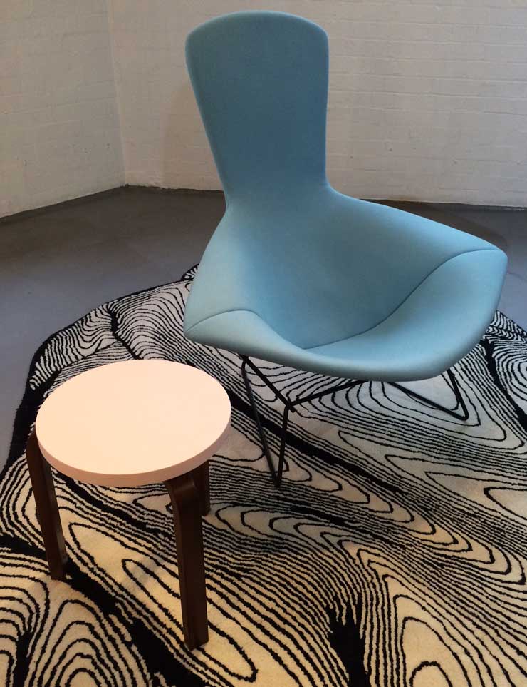
Aram Store is bang-on-trend, as per, with a lovely example in-store of Pantone’s colour blend for this year in the form of a Bertoia ‘Bird’ Chair by Knoll upholstered in a serene, pale blue Divina fabric flanked by a rose tinted Hella Jongerius edition of the classic Aalto 60 Stool for Artek.
Come and feel the calm.
Myles Brown